Learn more

Lamppost
Strategy
Brand
Copywriting
Website design & development
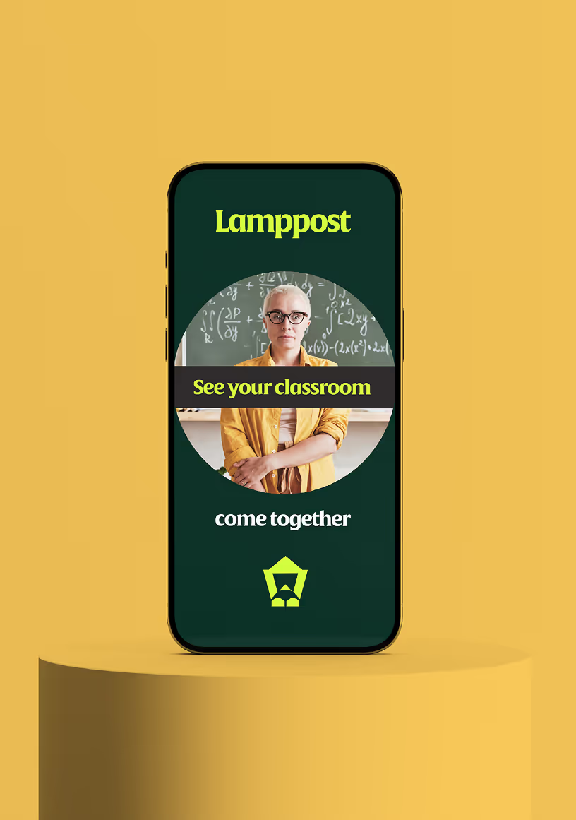
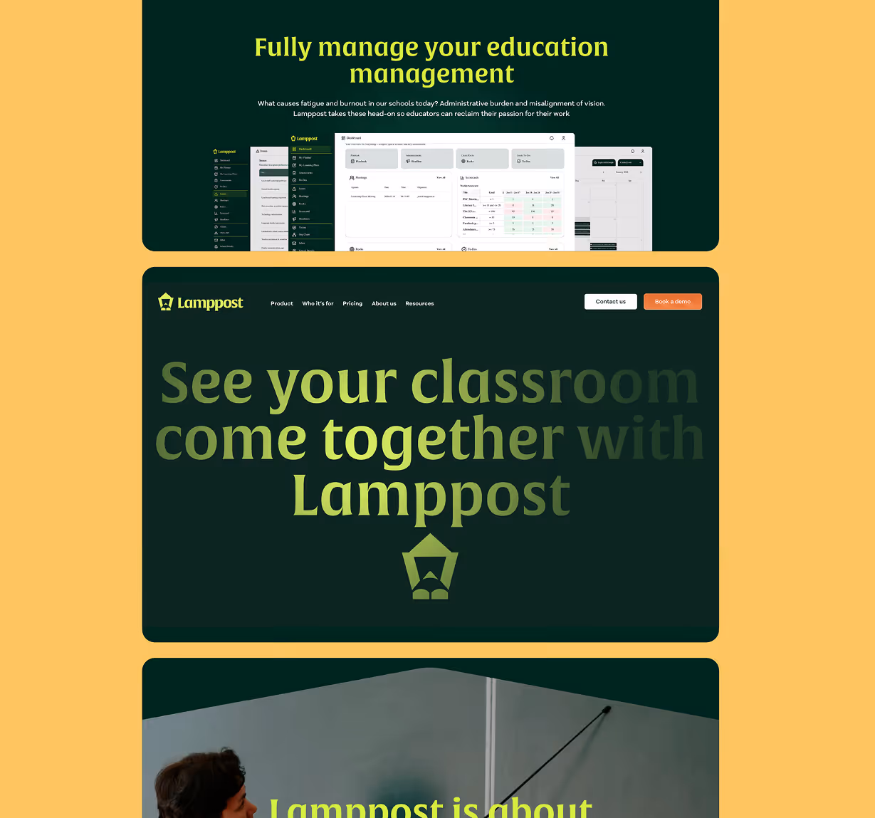
Lamppost is an all-in-one education management platform that integrates fragmented systems into a single, intuitive repository. Born from the need to combat educator burnout, it provides teachers, principals, and superintendents with the tools they need to align daily lesson planning with provincial curriculum and district goals. Our role was to develop a brand identity and web presence that felt as organized, calm, and guiding as the software itself.

Challenge
The EdTech market is crowded with tools that often solve one problem while creating another: administrative fatigue. Lamppost needed to stand apart from clunky legacy systems and hype-driven AI startups. Our challenge was to position the brand as a "vision-aligned" partner—providing an illuminated path forward for educators without adding to their already heavy cognitive load.

Insight
Centered on the concept of "Wholeness," our strategy shifted from a feature-heavy pitch to the human experience of teaching. Using the metaphor of a steady, reliable light, we crafted a brand voice that is both supportive and authoritative. The goal was to communicate that Lamppost isn’t just another tab to open—it’s the only one they need.


Solution
We developed a visual identity characterized by clean lines, a grounding color palette, and a user experience that prioritizes "at-a-glance" clarity. The logo and visual system evoke guidance and stability, while the web interface speaks directly to the unique pain points of teachers, principals, and superintendents through tailored messaging.

Impact
The new brand positions Lamppost as the premier choice for Canadian schools fighting staff burnout. With a cohesive identity —from their "AI-mindful" philosophy to role-based dashboards —Lamppost now offers a professional, approachable presence that resonates with educators and decision-makers at every level of the district.


Let’s
talk
get in touch
Let’s


